::A/S Shop:: Tutorials/PSD/Textures Here - DT Note Pg 86 - Page 44

Created

Last reply

Replies

863

Views

207546

Users

129

Likes

2796

Frequent Posters

-Aniisha- thumbnail
Anniversary 11 Thumbnail Group Promotion 6 Thumbnail + 3
Posted: 7 years ago
@Avengers - Thank you so much :) It was very helpfulEdited by .Khamosh. - 7 years ago
Lianaa thumbnail
Anniversary 14 Thumbnail Group Promotion 9 Thumbnail + 5
Posted: 7 years ago
||  IpekCreations#10 ||


PSD#66 Zayn Malik


PSD#67 Pastel PSD


PSD#68 bright pink


PSD#69 romantic


PSD#70 2 Pastel colorings in one!


PSD#71 MR. ROBOT.


PSD#72 Beyhadh


PSD#73 incredible


Show me your works using these PSD's by posting them here.
You can Request for PSD's! :)


IF YOU WANT TO SEE MORE PSD's OF MINE, THEN PLEASE GIVE A BIG LIKE! (:


I have Posted Dividers on my Tutorials Gallery.


DIVIDERS


It's for Free! But I would be glad if you would recommend your friends the dividers, maybe I will make more like these. https://www.golook-telefonia.it/wp-content/uploads/2016/02/Nuove-Faccine-Whatsapp-Significato-04-150x150.png


RED


For more..  NazCreations Tutorials Gallery


Show me your works using these PSD's by posting them here.
You can Request for PSD's! :)


Texture 008 purple pink


Texture 009 pink


Free 2 use! Credit not mandatory but much much appreciated! :)

You can get the download link in my Gallery (:
Madhura.. thumbnail
Anniversary 14 Thumbnail Group Promotion 7 Thumbnail + 4
Posted: 7 years ago
Originally posted by: .annihilation.


GO MAKE YOURSELF ONE. We'll help you with it if you need any help or advertise your place. πŸ˜›


Yes surely am IN in mission of Ri's Shop.
x.titli.x thumbnail
Posted: 7 years ago
PS - Tutorial #1 - 
How to add gradient map? 


Sweethearts, 
I'm sharing here my first ever tutorial, sorry in advance if it's not that good.πŸ˜• I'll try to translate everything into English since I'm using PS in French!πŸ˜²πŸ˜† 

Step #1 
Open your project


Step #2 
Duplicate your layer and set it to "screen" mode.
(I've put here 75% because the caps for my icon are not that clear) 


Step #3 
1. I duplicated the layer once again and I set it to screen mode (same settings as step #2) 
2. I added one of my colourings. 


Step #4 
On your top of your PS - select "layer" then "new font" 

1. Use the second option (not the first one "unique colour" one)

Step #5 

something like this will appear


Click on ok andd you'll see this

1. Click on the black & white gradient.
 

2. Choose the 3rd gradient (on the top) and click on ok.

Step #6 
1. Convert the gradient into "dynamic object" - For that just click right on your font and you'll see the option.


2. Set your font into "lighten" mode.
3. Use CTRL + T to move your gradient.
4. Duplicate your font layer if you want to add the effect somewhere else in your siggy.


and then you're done! 


***
hope it helps πŸ˜†
πŸ€—


Phir_Mohabbat thumbnail
Visit Streak 500 0 Thumbnail Visit Streak 365 0 Thumbnail + 8
Posted: 7 years ago
Originally posted by: Madhura..


Yes surely am IN in mission of Ri's Shop.


You guys give me wayy too much importance than  deserveπŸ˜†πŸ˜† 


@Maria dude why you using french photoshop????!😲🀣 lovely tut. Thank you for sharing!
soni19sweet thumbnail
Posted: 7 years ago
@.annihilation

thanks for text tutorial here i tried one with box

annihilation thumbnail
Anniversary 14 Thumbnail Group Promotion 6 Thumbnail + 3
Posted: 7 years ago
^^ That looks good, Soni! 
soni19sweet thumbnail
Posted: 7 years ago
Originally posted by: .annihilation.

^^ That looks good, Soni! 


is it i thought i make worst signature here πŸ˜†
annihilation thumbnail
Anniversary 14 Thumbnail Group Promotion 6 Thumbnail + 3
Posted: 7 years ago
Originally posted by: soni19sweet


is it i thought i make worst signature here πŸ˜†


Don't pit yourself against the others or compare yourself with them. Just keep learning and doing the best you can and you'll be fine. As for the signature, it really is pretty. πŸ˜³
Phir_Mohabbat thumbnail
Visit Streak 500 0 Thumbnail Visit Streak 365 0 Thumbnail + 8
Posted: 7 years ago
The Signature Tutorial-


This is not really a tutorial as to how to make siggies. Better members than me have explained them and those are the reasons I am now here, preaching.🀑 It is more like after merging. Or what parts to keep in mind while you merge.


1. You are no (insert a fabulous sig maker who's the reason you are into PS). So looking at them and sulking at your own work will solve nothing. They have reached saintdomπŸ˜† after many many attempts. You will reach that phase too, but practice! What you can do (after drooling over the siggies, of course), is to notice the thing as a copy cat. Really, this is the first step to make a siggies, try to copy. The best part of siggie making is you can never 100% be exactly like your inspiration. Something will be different, and that difference would be your own unique style. And whenever you copy a specific style always, always credit the siggie maker. 


Before the ranting started I was talking about really noticing the siggie. Look at the picture placement, number of pictures used, how they are merged. If you get the blending right 90% work is done, trust me.


2. Rules of merging- 


a)Baal se baal mila.
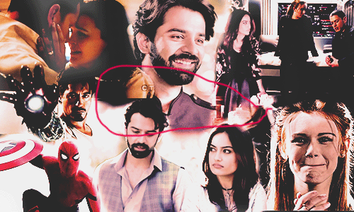

It sounds hillarious.πŸ˜† But it's true. Blending against black is easiest thing, and hair is generally black (unless you merging red head or some other color wali characters.) See this.


Kitthe Surbhi, kitthe Lydia! Now see this.


A bit cropping, and some level adjustments later


Tantana.


You can see many many examples. The point is hair or not, same BG needs to be there.


b) Take same scenes wali pics.


See this


The reason blending was good (I guess?) is cause all pics came from same scenes. The funda is same scenes wale caps have same bg, and mixing them together with a nice text is relatively easier than pics which come from all over the places.


c) when it's all a mess.


This can't get worst than this.


Tony Stark spiderman Tanhaiyyan (Internet hot favorite baeπŸ˜›) Lydia Snow white and prince canary and captain cold - it can't get any different than this. After blending them the best way you could do now you are left scratching head as to how to color them such as they look decent. Or should I erase more? Leave a few pics?

What I learnt from mixing different pics is this- after the basic brightness-contrast-sharpening ritual you gotta set them all a common color on which you can do adjustment. Think about a black and white siggies, so easy to do na cause you only have two colors? Think like that. For this siggie after brightness-leveling I did this.


Photo filter our secret weapon. Don't worry if it's too orangish or some other disgusting color. We will fix them. Use color balance and whatever other adjustments you want to. It will look wayyy better and you will feel better, too.


3) Text is our last sahara.


It's literally is. You not putting them for some feels or shit, naaaw! You putting them to cover up places which looked like gaping wound ever after you used everything you could. 

Now upar wala siggie has a big gap right in mid of it, small enough that I can't put any pics or if I do it will look yuck thoo, big enough that it's ruining the look. Now you have only text left, so use that.


Better.


Tata.
Edited by .Avengers. - 7 years ago